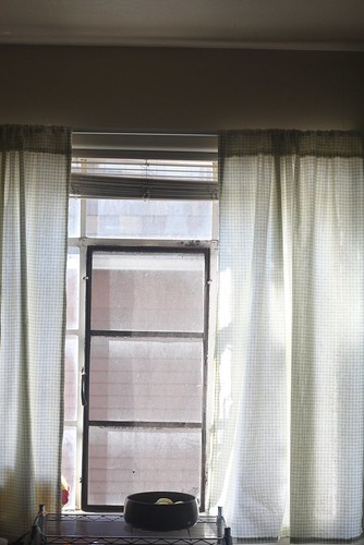
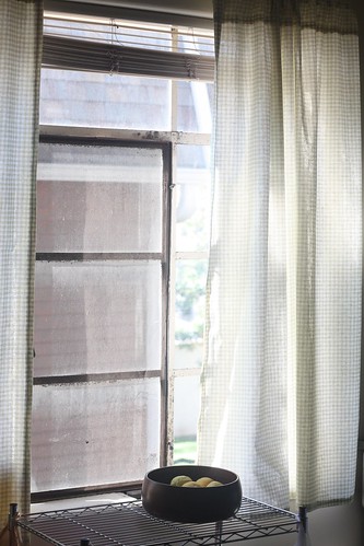
Apparently I don’t have any proper “before” photos of my kitchen window in all it’s bare “glory.” Glory is the wrong word. The windows are still sort of dirty and the ugly blinds are still hanging, but I figure I can tackle those things another time. I wanted to add some sort of covering, though, to frame the window and add something to that wall space without blocking the light too much. The light is important, see.
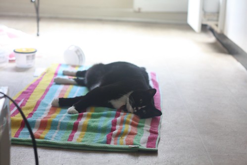
Someone has to have a space to get her vitamin D. (Can cats even get vitamin D through all that fur? Do they need vitamin D? …This is what happens when I try to be funny.)
For future reference, it’s really hard to take pictures of curtains with natural light. You know why? Because you’re shooting into that natural light, what with that whole “window” thing.
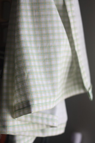
I picked up this fabric, a Michael Miller kid’s line checked… plaid… something, in this skinny olive green and yellow stripe (tres 1970s-style) at Fancy Tiger on sale for 50% off. It’s perfect—it fits into my “dream” kitchen, which is “Sprite”-themed. I don’t know why, but I dream about a kitchen that’s mostly white with lime green and lemon yellow accents.
The white background is sheer enough to let light in and doesn’t overwhelm the space between my kitchen counters and my bakers rack, but provides a nice “bridge,” along with the metal wheeled rack, between the kitchen and dining areas. Here’s a close up of the fabric.
Nothing overwhelming yet still charming. And another tip, especially for beginning sewists: check, plaid, gingham prints are all great for sewing even hems. Just fold everything so the lines are straight! (As long as you’re not trying to get fancy and sew on the bias, but even that can be helped along by lines on the fabric.)
Hopefully this weekend I’ll be able to work on another house project or at the very least, get the place tidied up to the point I can take an “after” video to splice with the “before” video I took a month and a half ago now.


